First let us open a new image of the size and resolution
desired. If we are working on an image for a web page or screen
the monitor resolution 72 pixels/cm is sufficient.
Under Photoshop before we start working it is advisable to
load a palette of colours. You can find web palettes for Mac
and PC in the page of Adobe.
The use of web palettes let us "see" exactly on our screen how
the final output will appear on the target platform. Not all
platforms and makers interpret colours the same way.
After loading the palette and with a new clean image open we
begin.
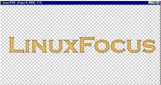
- Fill the first layer with white colour.
- Write the text (Please remember to use a thick type
because applying too many effects on a thin type will
make it illegible).
|
 |
|
- After writing the text Photoshop creates it on a
new layer. Just merge it to the white layer.
- Make a copy of this layer..
- Select the copy and invert it. (That is make white
colour into black and the other way around).
|
- Next apply a Gaussian blur to the inverted image.
The amount of blur to be applied depends on the
resolution of the image. For an image of 10 x 5 cm at
72 pixels/cm resolution it is sufficient to use 3 or 4
pixels.
|
 |
|
- Now it is time to play !!! We can start testing
various ways of combining both layers. This way we can
experience the effects made by the layer operations
like : multiply, divide, intense light, soft light,
luminosity.
For this example I have chosen divide y here is the
result! Nice and simple.
- But this is not all. If you notice carefully what
our combination did was to let through slightly the
black colour only in those regions where the borders
where blur.
|
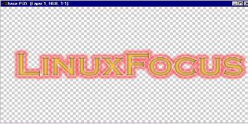
- After having done all these, without merging the
images, we select the magic wand. In options we choose
a small tolerance in order to select only the white
background, for example 10 and we select all the
background and the hole of the "O". After everything is
selected erase it.
|
 |
|
- Let us make another copy of the layer. Hide the
upper layer. Push the edit quick mask mode to preserve
the transparency and paint over the text filling up
everything in red.
- Now we can opt for two interesting steps:
|
| First we can fill the text in the background with any
colour, several colours or even a texture, and if we go to
the upper later (with diffused borders) one can combine it
in a couple of ways: First by multiplication .... |
 |
| .... Or with soft light . The final effect is
completely different but equally good. |
 |
| If you decide to use a texture the results can be
incredible.... |
 |
|
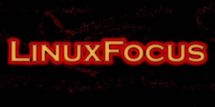
- We have created the main text already. This result
is already excellent for a title on our web page. Let
us next introduce a bit of incandescence effect on the
text. This will enhance the perception of the
text.
- First combine both layers. The will end in normal
mode.
|
- Select the background (which is simpler to select
than the text). To select it go to the magic wand and
select 'similar'. That would select everything...
|
 |
|
- First let us make a new layer just in case we do
not like the changes introduced and would like to try
the same effect with other parameters.
- After selecting the background and the holes of
fonts like "o" shrink the selection a bit, about 3
pixels. Then feather it 2 pixels.
|
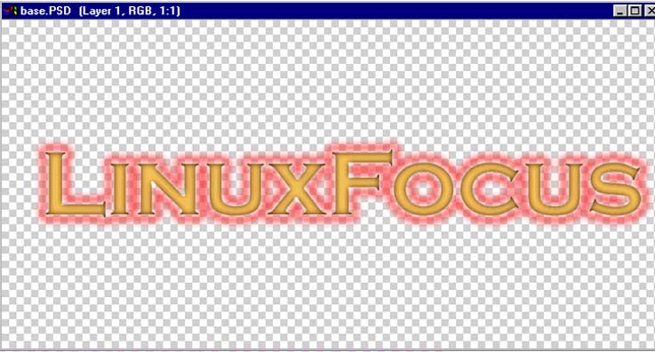
- Next fill the selection in a strong red color and
once again shrink it 4 to 5 pixels (always take into
account that these numbers depend on the resolution of
the image).
- Feather the selection once more 3 pixels. At this
point delete the selection pressing the DEL key.
|
 |
|
- If you do not like the result try again using other
values for the parameters or even copy the layer
multiply it with itself to enhance the effect.
|
 |
|
Other articles in the series
|
|
![[LinuxFocus Image]](../../common/images/border-short.jpg)